I've been making icons a lot recently. I suck at text, so for the past week I've been perusing icon journals to see what exactly good text on icons looks like. And you know what? Everyone had better text in 2006. EVERYONE. Weird. Anyway, I've been practicing with text and I've come out with some decent things. I'm showing them off here because it will doubtlessly be ages before I collect enough in these fandoms to feel justified updating
![[livejournal.com profile]](https://www.dreamwidth.org/img/external/lj-community.gif) iconzero
iconzero (Really I ought to just start making multifandom icon posts... but I like single-fandom ones because it's easier for me to find things!). Concrit is welcomed, especially if you have text suggestions.
These
Ocean's 11 icons are the most recent I've made and look exactly like I'd wanted them to. They're so pretty I can barely believe I made them. I want to make a million more for the rest of the movie, all in pretty blues with skinny text. Then there's this
sg1_lims entry for the "I'm too sexy" challenge. It's another where I look at it and go, "I made that!? ME? Really?" Also, I spent about half an hour drawing and re-drawing squiggly lines.
The BSG ones are from when I was just starting playing with text again. Also, vipers are sexy! Oh my god, I like them more than X-WINGS. Do you know how AWESOME something must be for me to like it more than x-wings? PRETTY AWESOME, that's how! Then there's the John Sheppard one that was my alternate last week at
lantis_lims and which people seemed to like. It was actually made by accident because I had this whole other thing in mind but then floodfilled with a pattern instead of a solid color and just decided to roll with it.
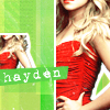
These don't have text but I kind of like them anyway. The Hayden Panettiere (however you spell that) ones were for an icontest. I like the bright blue/cyan color but I also like the b&w one. It's so silly because I actually won the icontest with
this icon, which looks way stupider than the first. The other is a Heroes cap that I liked for the weird reflections (Peter, through a car window!). I'm pleased with the colors I got on that one because for the longest time I was just coming out with weird murky greens or too-bright oranges. But I'm not at all sure how it will play to people who haven't seen the original cap.
Then since
![[livejournal.com profile]](https://www.dreamwidth.org/img/external/lj-userinfo.gif) fungus_files
fungus_files was talking about Heroes and Mohinder icons, I had to go make a Mohinder icon for myself. Because he's pretty. And as you can see, I was somewhat indecisive about the whole idea of this icon.
Then I decided I needed a Mohinder Suresh banner because I liked that cap, and I ended up with this:
Of course, after realizing that looked AWESOME, I had to make one for Peter. But I couldn't think of a good tagline. If you have any ideas please tell me.
So far I've started ones in the same style for Hiro+Ando, Claire, and Nathan. I've got a system worked out and it's not taking too terribly long now once I find the right caps.
Also I changed
my layout to use the Mohinder banner. Usually my layout is 700 px wide but this banner was 800 px... which is just frighteningly wide. There are words all over the place! I get dizzy just looking at it.